ShopDreamUp AI ArtDreamUp


Comments11
Join the community to add your comment. Already a deviant? Log In
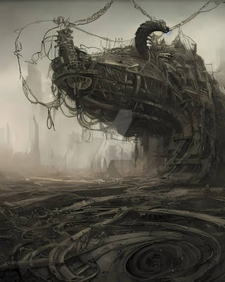
Really nice picture. Love the colours. Only one thing is bugging me... those stairs in the foreground are freaking massive. A person must jump and pull themselves up each step. Inless they are steps designed for mechs, they are definately too big. Alter that a bit and youve got a cool paint!